HART / FORM
CLIENT HANDOFF / V1.2
02 / IDENTITY MARKS
Logo
The wordmark carries the editorial voice. The monogram is the compact signature when space is scarce.
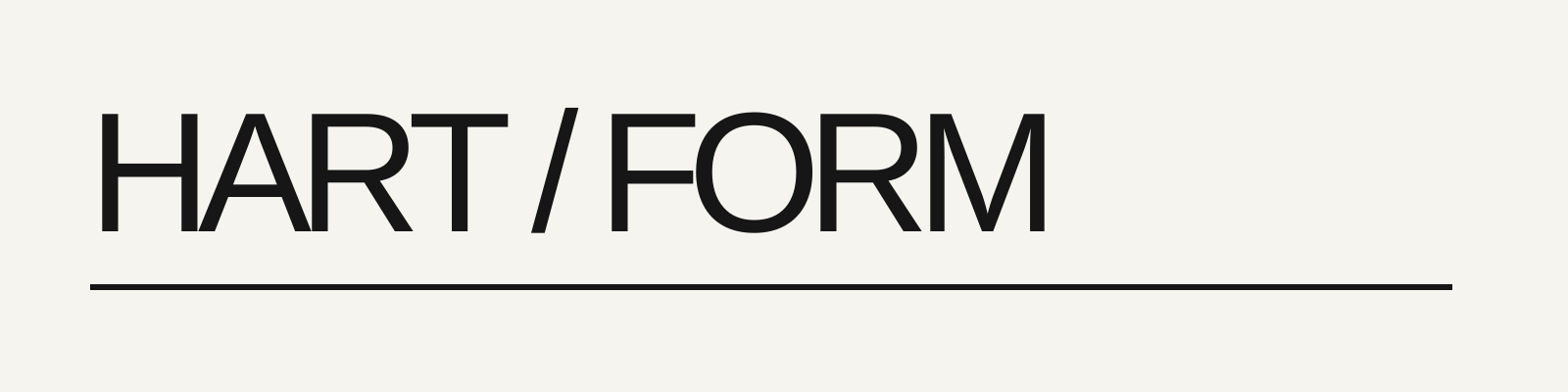
Primary wordmark — graphite
Primary mark for light surfaces, formal documents, and object labels.
Use at approved clear-space ratios only.
Approved
Logo
SVG
v1.2
Light

Primary wordmark — paper
Primary mark for dark surfaces and field applications.
Use only on Moss or Ink grounds.
Approved
Logo
SVG
v1.2
Dark


PRIMARY WORDMARK / Use the supplied artwork for object labels, documents and the site masthead. Keep clear space equal to one capital-letter height on every side. The visible mark should remain at least 24px high on screen.
MONOGRAM / Use the compact HF mark for avatars, stamps and small labels. Keep it at least 32px square on screen. Do not combine it with the wordmark into a new lockup.
BACKGROUND RULES
Graphite marks sit on Paper or light material. Paper marks sit on Ink or Moss. Never place a mark on busy photography, Vermilion, or unapproved color fields.
DO / DON’T
Choose a rule below, then switch between Do and Don’t. Each example explains the decision behind the approved treatment. These diagrams teach usage; download the supplied master artwork for production.
Use the system with intent.
Keep the supplied wordmark in its original proportions. Leave one cap-height of clear space on every side.